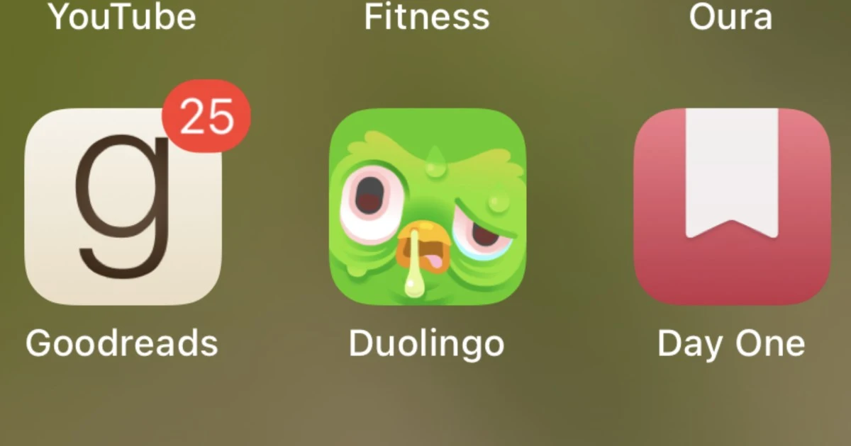
Does your Duolingo app icon look sick? You're not alone
Does your Duolingo app icon look sick? You're not alone

www.digitaltrends.com
Does your Duolingo app icon look sick? You're not alone | Digital Trends
Does your Duolingo app icon look sick? You're not alone
Does your Duolingo app icon look sick? You're not alone | Digital Trends
It's just for marketing attention, saved you a click.
And there really is no reason other than that. I assumed there was meaning behind it. There is not.
I thought it was bird flu awareness
Man, fuck Duolingo. The users came up with these jokes about the product because while it's useful, it's also annoying as hell, and they turned that into a marketing campaign.
Lazy ass mother fuckers oughta pay the users for writing their marketing plans
This was recent.
That's a genius idea. A disgusting app icon that can be reverted to normal only when you pay a subscription
Reddit also tried that shit
Unless users uninstall the app
People used the Reddit app?
I'm on the free trial of DL. It's still this ugly icon.
Yea but (on reddit at least)you get the option to change the icon. It doesn't change automatically
I noticed that icon in the play store the other day. I assumed it was a scam/copycat app trying to be distinct enough to avoid a takedown or something.
I'm still afraid of the duolingo's lose streak reminder. It's so annoying, especially in my email inbox.