Ah yes, Because That Is What Makes a Good Logo
Ah yes, Because That Is What Makes a Good Logo
Ah yes, Because That Is What Makes a Good Logo
I work in an industry that deals with customer logos almost exclusively. I now get at least one person a week bringing in garbage-tier art they made in Canva or whatever that isn’t made to any standard at all, so they have tons of thin lines, gradients, blurring, etc. Shocker, AI only thinks about making it visually appealing when it won’t translate to a one-color, doesn’t have PMS tones to base it on, no simplified version, etc.
People think making a logo is just that. Just the image itself. They don’t think past what’s in front of them.
In my experience, most people have simply never thought about it before. If someone decides they want to open a bakery and they have never had a business before, they haven't thought about everywhere their new logo will be used unless they get that expertise from someone. I've gotten pretty good at explaining these concepts to people and they typically respect my expertise and take my advice, but not everyone 😆
And that’s just it. In the past, you would have contacted a branding firm and paid someone with expertise to do all that for you. Now people think, “Why pay a branding firm when AI can do it in 5 minutes?”
I would think AI art would be perfect for the use case of “here is the general gist of what I want, now turn it into something usable”. I can also imagine basically nobody actually using it that way correctly though lol.
They don’t think past what’s in front of them.
I'm pretty sure you just summarized the human paradigm.
Devil's advocate: Another way to think of it is that as AI tools mature, we will see more tools make an impact the way template-based web builders transitioned us away from, at best, charmingly kitchy html business websites of '95-'05 that are horribly optimized and broken half the time towards standardized options that cover the basics with curated choices for clients to express themselves without hanging themselves. Yes, the template builders did homogenize business websites, but for all the businesses that weren't going to/couldn't pay for a serious web developer/designer anyway I'd rather go to their website and experience a bland predictable layout than experience my browser melting even though there may be a glimmer of creativity from the enthusiastic teenager they hired to build it from scratch (I was that teenager).
We're all fixated on how AI could not do the work for the top 25% of clients who require high quality professional work. We forget that 75% of clients cheap out for DIY/scam/hack options when it comes to design, resulting in lots of crap in the ether. AI tools have huge potential for smoothing out the low-hanging fruit of basic pain points.
The difference will be that AI doesn't understand the basics and can't curate choices to instead it will be a regression to wildly different and unoptimized web pages as each person wants to do their own spin on things instead of listening to experts.
We're actually already seeing this happen in some cases. There's a company that I believe Procreate has partnered with that is commissioning designers to create website elements for them to train their AI with for their website template creator.
That being said, there are also thousands of logos that go through proper design companjes and they pay a lot of money out and get literally just the name in a standard sans serif font or abstracted until it is unrecognizable as a name like KIA or TVA.
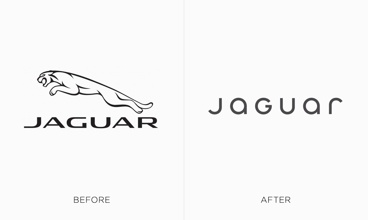
https://digitalsynopsis.com/wp-content/uploads/2024/02/logo-redesigns-rebrands-worst-jaguar.jpeg
https://nataleerushurst.blogspot.com/2022/08/alphabet-company-history.html?m=1
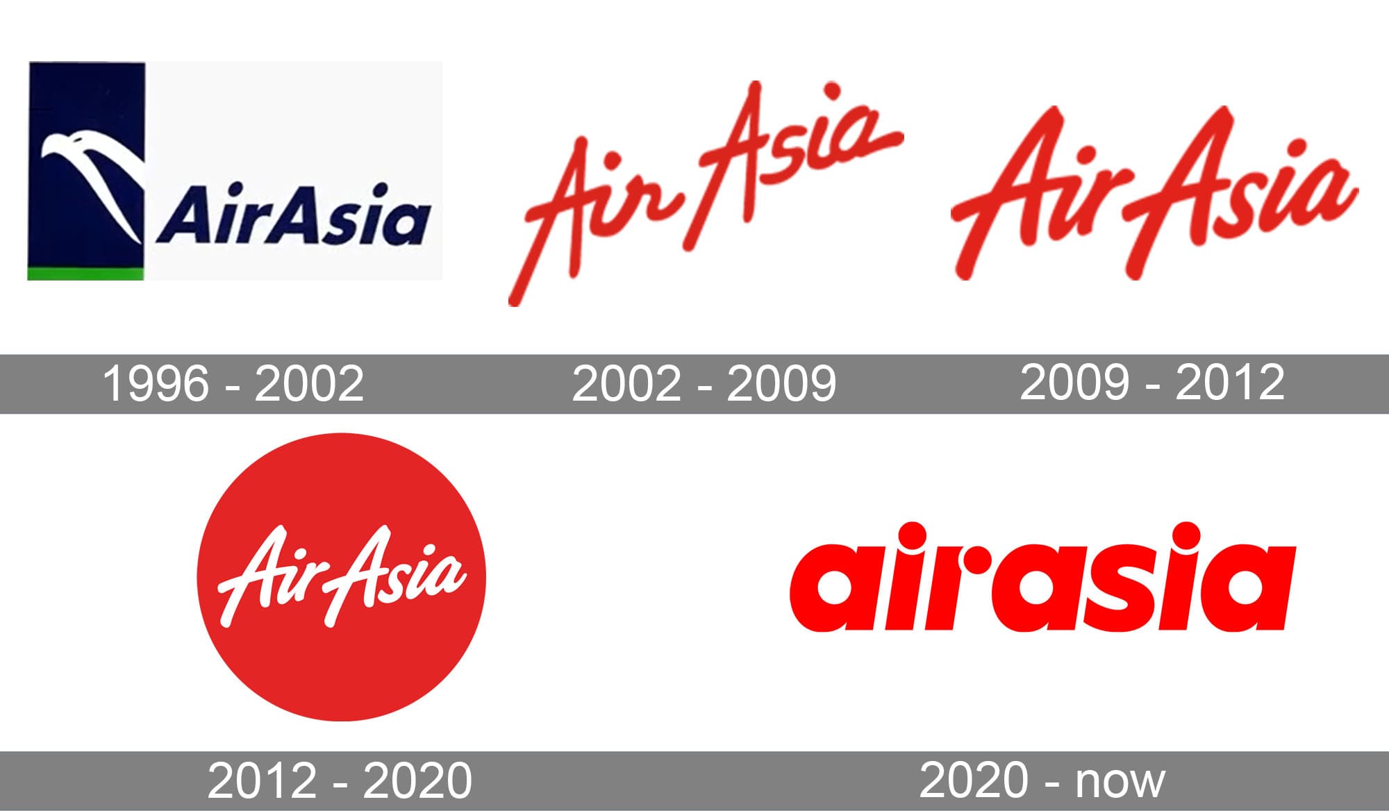
https://1000logos.net/wp-content/uploads/2020/04/AirAsia-Logo-history.jpg
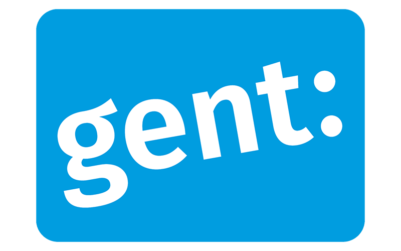
https://storage.googleapis.com/ftidag_prod/activities/stad-gent-2/logoGent_c100.png
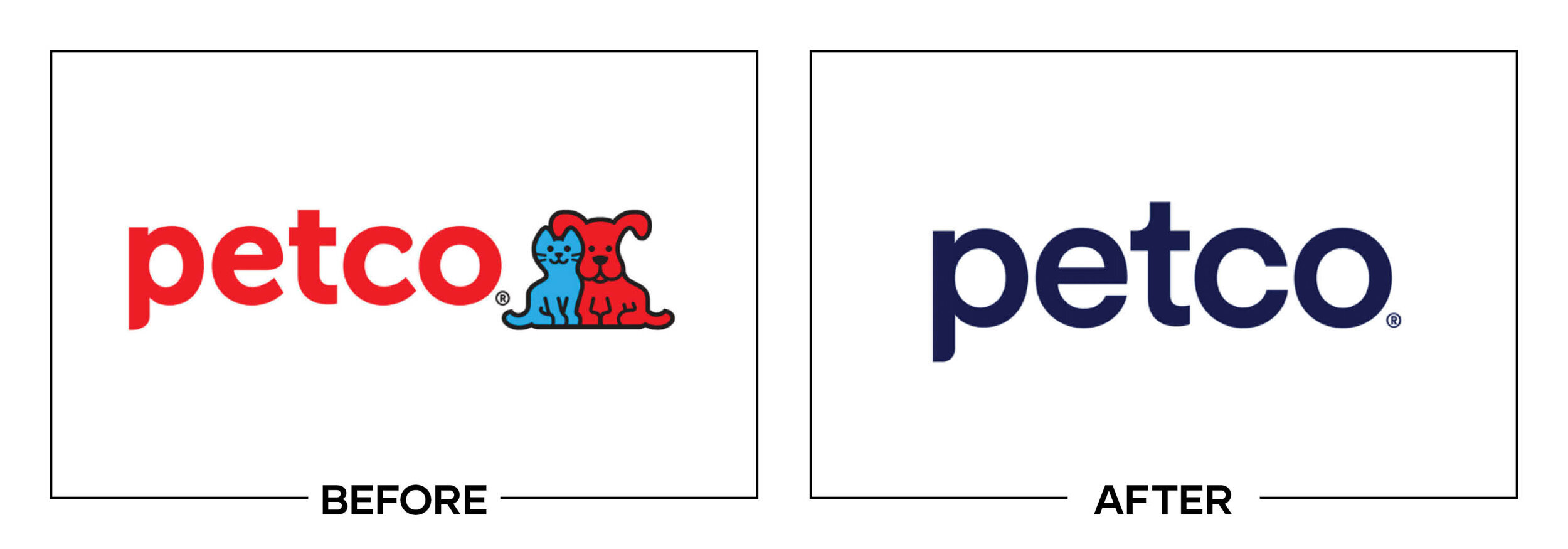
And the list goes on, Verizon, gap, tropicana, jcpenny, etc...
I mean, AI is trash, but it can also be extremely difficult to know if you will get a decent logo after paying thousands or tens/hundreds of euros spent (looking at you Belgium cities using millions of taxpayer euros for bad rebrands).
See I was all against the new Kia logo until I saw their new cars they started releasing about a year later. It really matches their new design language. I think they should have rolled out the new logo on cars only after their refresh so you don't have older style vehicles with the new style logos
tbh I prefer a logo with lots of colors and gradients, depth, lighting, etc. These ugly ass flat or outline logos have really ruined things
Personal taste is totally fine, but what you're describing isn't a logo, it's an illustration. A good logo specifically must be simple so that it can be applied across a bunch of different contexts — print, digital, large, small. What if you wanted your logomark as a favicon? Depth and lighting would make it look like a smudge at that size. What about stitching your logo onto a hat?
This is the main issue. Logos are part of a brand system, and generating a logo with AI circumvents all that thought. You get something that might look good, but your whole system becomes super fragile.
Again, there's no disagreeing with personal taste, it's just a matter of thoughtful use of the system and medium.
Try embroidering your "logo with lots of colors and gradients, depth, lighting" on a polo shit and see how little of it actually translates. Or even a one color print job on a mailing. It will look like an unrecognizable hot garbage smudge.
That's really only suitable if the logo is going be displayed at a larger size on a screen. Many times logos will be displayed much smaller, such as when used as a favicon. When you cram too many details into a small space it just becomes noise. This also applies if people glance at the logo, since too much detail will make it difficult to work out what it is.
Also as other people have mentioned. If you are going to be printing your logo, then you do need to have a design that uses just negative and positive space since it's easier to print and will look much cleaner.
Additionally it's pretty common for organizations to have multiple versions of the logo as well. Usually a black and white one, a colored version of it, and versions with and without text. They could also have a more detailed version of the logo as well, but the other versions are more useful, so they may not even bother.
You might just need two versions. The full colour one where the underlying medium supports it well, and a mono version for more restrictive media.
That logo is terrible.
Like, a core component of a good logo is that it’s easily identifiable at a glance at all shapes and sizes and on various backgrounds… complicated photorealistic logos basically lack all of these criteria by default.
This is why you need someone experienced not some ai slop.
anyone with a year of design training will know why the right "logo" is a pile of shit.
anyone with a month of experience printing will know why the right "logo" is a pile of shit.
anyone who has had 5 minutes with genAI will think they're a design master when they create the "logo" on the right.
I disagree.
Anyone who has spent a few minutes thinking about what a logo is and what it's used for will be able to tell you that one of these is a logo and the other is... a picture.
No experience in printing, but I guess its impossible to Print that Logo with that Kind of Detail in a timely manner without it looking like shit?
Also, everyone who ever heard about web design and hosting will know that such a picture is impossible to scale up and down, and also that picture will take up literal gigabytes since you can neither use normal PNGs because of the quality nor vector based art (they store the picture as mathematical equasions, so the PC has to render them, but it can be indefinitely made smaller and bigger without it becoming more pixely) because that sort of detail will just be impossible to render on grandmas smart TV from 2010, so you will have to store this picture as PNG in different formats as many times as you want to display that image
No, you understand the printing problem. Any logo needs a vector version so it can be scaled to any size. Lacking that is a non-starter.
And don't start me on the colors.
No. You don't need a year of design training. It is redicilous you buy in to that idea. It is a rage bait ad because it generates most clicks and therefore ad company revenue. Nobody alive thinks that is a good logo. That is the point.
MagicShot.ai - Al Logo Geneator
Geat work
I've seen so many commercials where a realistic scene fades into the stylized logo that that's what my mind went to.
The left is a better logo, fewer fine details, easy to silk screen, easy to laser print, hell you could make a branding iron and burn it into wood.
Logo on the right is what you give a marketing team so they can tell you the 600 ways it won't print right, cost too much to display, and ultimately rework it into logo on the left.
Looks like they are missing the plot. Logos are supposed to be simple...
Did you seriously think the freelancer isn't capable of creating something like that? Like, do you think that FedEx uses their name with a hidden arrow in the "Ex" because they couldn't hire anyone to draw them a photorealistic delivery truck with a box on it or whatever? Microsoft can't figure out how to make a window with reflections so they use the squares?
The simplicity isn't an accident.
Right?!? I wonder what happens when the business with the AI logo has to pay for full-color printing for all of their materials because their logo is so visually complex.
This isn't an issue if you solely operate digitally, but a storefront needs signage. Advertising becomes much more expensive in process color than 1 or 2 spot colors. Most physical businesses need things like business cards, invoices, purchase orders, packaging, ...
A professional designer will usually create a 1-color or 2-color logo to use for some of those things even when you have a full-color logo design to use on the most "important" materials. AI won't give that level of service, for sure.
"I created" and "with AI" is the newest oxymoron.
Art imitates life
This is the modern-day equivalent of Frontpage/clipart
I get what you're saying (esp low-quality clip-art), though lots of clipart was actually vector art (like autotraced from physical art, giving some prominent styles) so would probably make for a better logo than what they generated here.
Imagine the printing costs of putting variations of the right on all your products? Just the color variety alone would add to the production costs.
Reminds me of German Designer Kurt Weidemann who redesigned the Logo of German train company Deutsche Bahn in the 90s. He inverted the colors, got rid of one outline — and still saves the company millions over the years because of the paint that is saved putting the logo on all trains. All while modernising the typography, but remaining true to the brand.
This is what design is about — everything else is decoration.
And will look like shit even if you manage to do it. Imagine that on a cushion cover after an year of use.
AI generated art is the new "cousin who knows Photoshop".
This is fine, and mostly benign.
Ai did a shit job.
-Ex graphic designer
Maybe your trained eye can tell better than me but it looks to me that the homecraft name in the AI one isn't even centered properly.
It's the style lol
The one on the right is prettier (not necessarily better. I've read some comments by people that know more than I do with some valid points). However, to create the image on the right, they probably fed the AI the image from the left, made by a designer.
Honestly, from a design perspective I do think the one on the right is actually better in some respects. Yes, it wouldn't scale well, there's too many colours, it's too busy, but it has some good points. The font choice draws you in more, with less space between the letters making it easier to read at a glance and the 'f' creating interest. And the house is actually united with the text, whereas in the left image it feels completely disconnected.
I would be pretty disappointed if I'd paid for a logo and I got the left image tbh, it's not very interesting or memorable. Yes, fuck AI, but I'm not sure this is the best comparison because both logos suck in different ways.
I wouldn't be surprised if she paid $5 on Fivr for the logo on the left just so she could say it's from a freelancer.
Honestly I was confused on AI made whicu one. Guess I am overestimating AI, in some sense & I need to improve my AI literacy.
Considering they probably fed the left image into the ai to make the right image, it’s rather silly.
“I made this logo with only an ai model, and can-do attitude, and a logo.”
I wonder if a fucker like this has commissioned a logo, fed an initial design through AI, and then refused to pay the initial designer.
"Guys I turned your Nike logo from a swoosh to wind blowing dust in a vague swoosh like shape also there's a foot there so you know where it came from and we'll stitch that on AAAAAAALLLL your products and guys... Guys? What do you mean I'm fired?"
I don't like either, but the left one at least scales better for various applications across platforms and media.
The one on the left is superior for a massive number of reasons.
Simple and easy to print, make copies of documents without becoming illegible, and other paperwork related reasons.
Easy to recognize at a glance. The one on the right is really hard to make out at a small size. Just a bland beige blob.
There is a reason most familiar logos are monochrome or only a few colors, and simplicity is one of them. The one on the right looks like overly bust clipart.
The one on the left is a couch inside a house with a lamp, all of which make sense together. The plants overlap the wall and there is a chandelier over the couch on the right one. Who puts a chandalier over a couch?
Ugh, I know it is obviously awful but I had to get it out.
so sayeth artist_mariana lmao
She’s an artist the way I’m a chef when I go to a restaurant and order food.
It's probably a bot for marketing the platform
Lol was looking for this comment
I legit thought Lemmy just got ads when I saw this post
Surprise, dear user! We're upgrading your experience to bring you only the best ads. Aren't you glad for us?
This is not an AI vs professional human issue, this is an issue with taste. You cannot prevent someone from pointing to the right option and saying "I want that to be my logo because it's a pretty illustration"
You can easily get ChatGPT to generate logos that are at least functional, give it a try. Start with
I'm not saying it comes close what a professional will give you, but it's a million times better than what your worst DIY client brings to the table.
That's fair. I think the biggest problem with AI logos is getting the AI to calm down. It can't help but to fill the slop bucket completely full; even if you tell it to keep things simple, it has an overwhelming urge to just keep pumping in more detail.
Imo, the left hand logo is better. Can you imagine trying to get the right side logo on a hat? Probably the best you could do for a reasonable price is a shitty screen print job that'll fall apart soon.
Maybe it's been a while since you last tried. As a test, this is the first logo ChatGPT generated after 2 minutes of typing from me. I wouldn't say it's a good logo, but it's not an over busy/problematic logo design wise.
I decided to see what would be made following your prompt. Here's the image.
Seems decent. Doesn't really have the warmth of a home, but that's more on the prompt specifying house without further detail. I took it a step further and told it to add a couch and a lamp like in the logo in the op.
I definitely prefer the freelancer one but I don't think it's bad. Certainly better than the logo in the op lmao.
Edit: given where I am I should probably specify I think it's not bad compared to the trash fire that is the ai logo in the op. Design wise it's very lazy and looks like someone threw in a pair of icons from an icon pack into a house in a generic way. The two assets in the house do not feel like they exist within the same space.
You might be in the wrong community.
I think the threats, limitations, and harms already underway due to AI are very real. And it's scary thinking how the issues will develop under the current ways such technologies get pursued and implemented to accrue power.
I also think we should be honest about the capabilities of the technology, the practical applications of it, and reconcile with the fact that the genie is out of the bottle. It's the industrial revolution, it's electricity, it's the assembly line, and nuclear fission.
Especially since the magicsh*t ai version will be SO identifiable as a favicon
I see an old-timey ghost inside a house silhouette.
What is up with the weird soft look that so many AI images have?
It’s probably trained on a fuckton of Thomas Kinkade paintings, just statistically, since his output was so huge. He also had that kind of lighting going on, so it wouldn’t surprise me if that’s just baked into AI image generation now.
Limitations of AI. That can't do it any other way. That's one of the ways to spot them.
Let me curse in Church for a bit:
I like the AI image more. Why? Because this "flat and colorless" trend of Windows 8 going forward has been a fucking curse. Everything is flat and colorless now :(
I've read some comments here, and I can agree that the generated image is too complex, but the original design has gone too bland for my liking.
/cursing
Eh, I mean... Boo! AI Bad!
Agreed
I'mma be honest: I compared the two logos before reading anything, and absolutely loved the one on the left. It made me instantly want to learn more about the company. The one on the right just looks like a low effort depiction of the inside of a house, and I lost interest in what it was offering before I even got to the company name. I clicked in the post to put in my 2 pence, then read the whole image. Yeah... AI sucks.
Spoken like someone who has no clue about graphic design
Sometimes I think the AI bubble is about people who don't understand computers being put in a kind of purgatory where they have to work out why everything is wrong and bad.
The Dunning-Kruger tool.
Mariana Lopez should have at least said which freelancer she got the sample from. What an insult to their work.
I hate that some real people actually think like this and don't see the problems here.
That thing just screams AI slop.
I would NOT support a business that has an AI generated image.
I know, that's not the point of this post, but does anybody else miss, when logos had more than 2 colours? I see it as a sign of enshitification. Every company now has a monochrome logo made of simple shapes, so it's cheaper to print on t shirts and easier to spot on a phone screen.
Right? I miss fun logos. I get everyone wants to shit on ai but minimalist logos are booooooring
I do prefer the AI font choice unfortunately
when it somehow produces coherent letters, the fonts to be an average of what we are used to seeing on every similar logo so they generally have the right feel.
I'm not a huge fan of the current ai crap but i would like if it was possible to output typable fonts in standard formats. for logos I would want it to be able to produce editable vector graphics but the only attempt at that I've seen made what should be a solid single shape as a million some odd blobs jigsawed together, so editing manually would require redrawing all of it. currently I'd be better off following some youtube tutorials for how to use inkscape or something.
The kerning is better in my opinion. That f is nice.
To be fair, the graphic artist stole that design from Ashley Home Furniture.
TBF, Ashley stole it from billions of artworks by kindergartners.
Stole it, or sourced the kindergartners artwork to generate their own without permission or compensation?
Ashley Home Furniture who apparently own the house shaped logo? No. Go and type 'simple house-shaped logo' in your preferred search engine. There are many uses by many companies the world over.
To be faaaair
.. Who in turn stole it from a monopoly board and turned green orange.
Lol try printing that on merch, dumb dumb. That’s an awful logo. It’s really not even a logo, it’s a scene.
Reminds me of the very first Apple Computer logo:
They dropped that for a simpler logo, and then dropped the simpler logo for an even simpler one.
I would love to see a parallel world where all tech companies logos were all this detailed and old looking
Wait, is that for real?
High tech with a 19th century sense of style? I'm sold!
Lol “dropped”
Well played.
Back in the day I legit wanted someone to make a custom black MacBook case that had the Newton logo instead of the Apple. Imagine how cool it would look glowing!
Yet that is still simple for its monochrome ..... While the ai logo looks like tacky clip art.
Morebranding than logo. Looks like a label from an old bottle of tonic.
Even if you took that image and used it to create a black and white illustration, it would be way too busy. The logo on the left isn't exactly amazing, but it's decent and checks all the boxes for usability and readability. The one on the right is more like... an image made for an ad which you can't put on a hat for example. The amount of times I've had to explain logo basics to a client who want to do something like the image on the right isn't great, but they usually understand why these rules are in place after explaining and they generally respect my expertise. But not everyone...
Why is the first thing I thought of Tabitha when I read dumb dumb XD