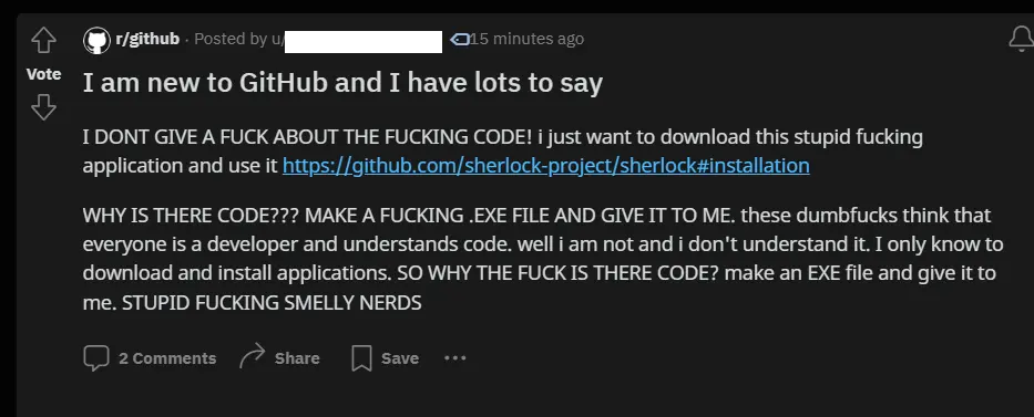
Hey, I'm new to GitHub!
Hey, I'm new to GitHub!


Hey, I'm new to GitHub!


You're viewing a single thread.
TBF, they could probably make the "releases" page more prominent rather than having it buried in all the "code" stuff.
GitHub has bad UX for people who just wanna download and use the programs
I'd agree, but the caveat is that github is primarily about an interface for source control and collaboration between developers for projects. The release page is really just an also-ran in terms of importance.
Imo they aren't even trying, because it's not that hard to make it better. Doesn't even have to be a compromise. Most people just need a visible download button for the programs, that's all.
If that's a concern for the project maintainers, they should create a homepage for the project with download links.
Or make a shortcut/link in the readme to the newest release of the most popular OS's.
A decent release page tends to contain all kinds of files for different OS, so 'regular' people who just want the .deb or .exe would likely become confused regardless.
I mean, if you don't even know what OS you're on...
Next you're going to tell me cars need boosters so babies can reach the pedals... At a certain point, it becomes irresponsible to enable ignorance.
Imagine how many download buttons would be if Github had ads.
SourceForge had a better UX for those who just want to download software.
And SF is horrible, so this says a lot.
There is, it's literally right there on the home page of the project. You can either copy a URL and download it by cloning the git repo, or you can download the whole project as a zip file. Then you just have to compile it!
GitHub is for developers, not end users.
It's not a compromise to make another download button for the last release as well. No one looses.
That's not a download button for the program. But there is indeed a link to the release page right on the home page of the project, so you're still correct.
Excel has a bad UX for people who want to use it to make art
Do most people who use Excel also make art with it? Because sometimes devs also just download exe files on GitHub :D
They don't just always copy code from there.
GitHub, Inc. (/ˈɡɪthʌb/[a]) is a developer platform that allows developers to create, store, manage and share their code
https://en.m.wikipedia.org/wiki/GitHub
Yes it has other functions too, but it's primarily for code.
Do MOST people who use GitHub download .exes? In my experience the VAST majority of people are using it for source and version control, not external releases. The overwhelming majority. FOSS and OSS is a small portion of the overall GitHub user base compared to, say, enterprise companies.
So you never downloaded a program on GitHub?
No one everever said you need to compromise its focus on developers. There is no compromise to be made. It's just a stupid button. Stop arguing lol.
No, you shouldn't really be downloading exe's from github. It is widely being used to spread malware and to pretend that the software is open source when it is not. At least look for a link to the store page(including microsoft store), a distro-specific package or build instructions. Those usually have an AV scan or at least harder to fake.
Yeah a dude I know got hacked by downloading some random github program, the hacker even started taunting him via discord lol.
But I downloaded plenty of shit from github, like prusaslicer, my 3d printer's firmware and plugins for octoprint. Always stuff that is verified via another page though. Almost never stuff that comes up during a random search, and if I do, I look it up first to see if it's safe.
The github project page is for developers, and Github already gives you tons of ways to make a user website. Don't ask your users to visit github.com/group/project, make them visit group.github.io/project, like any sane person.
Same with Gitlab, BTW.
And if you don't like the full static site, use the wiki, or guide your users in the first paragraphs of the README so they find the user information if they must.
you never downloaded a program on GitHub
Precompiled binaries?!? Not even once. It's a security risk akin to picking up gum on the sidewalk for a fun tasty treat.
So when you just needed software to run on your machinr, you built it yourself. But first read every single line of code to ensure that it's safe. Did I get that right?
Because if you don't trust the developer to provide safe binaries then you wouldn't trust the same developer to provide safe code either.
Cool, I'm not surprised as we are on Lemmy. Welcome to the 1%.
We’re talking about how to design one of the biggest platforms on the internet. Of course there is a compromise. No one is advocating for removing the button, but arguing that the UI is somehow deficient for people wanting to download binaries is really missing the purpose of GitHub.
It's an additional feature of GitHub that literally everyone uses. Therefore it has purpose. I think it's ridiculous to argue against it.
Explain to me how developers or the UI would suffer from easier access to releases?
Literally everyone? I’ve been a software engineer for ten years. My company doesn’t use it, and no company I’ve worked for has. I guess they are not part of “literally everyone?”
Explain to me how GitHub working on one product feature (releases) has no impact on how much they can work on others. Apparently in your rich enterprise software career you’ve found that resources and time are limitless? Or maybe you think it’s trivial for a platform like GitHub to change their UI.
This smacks of lots junior software engineers I’ve worked with who think problems are simple and solutions are easy because they’ve never actually DONE anything. I get that you’re very convinced that this is easy and cost less but it’s pretty clear to me you have no idea what you’re talking about.
Again. I've said before that release downloads are an additional feature. But it's a feature most people use. Neither did I say it was easy, nor it was cheap. Just that it makes sense and that it doesn't take anything away from the professionals regarding UI quality or focus.
No, what you mean is YOU use it and you’re assuming most people use GitHub the way you do. GitHub is first and foremost a platform for GIT. Git has nothing to do with releases or file downloads per se. Time spent improving the releases UI is time not spent doing other UI improvements. If you need more proof that it’s not worth it to spend time on the release UI, just take note of the fact that GitHub is not spending time on the release UI. If everyone was using it and it was deficient, do you really think that would be the case?
It makes sense from a pure UX perspective. But of course the real goal of GitHub is to make money, and their paying customers are mostly corporate entities using it for enterprise development. Unless those companies decide that a download button/better release feature is desirable, it's not likely to happen.
Most corporations tie GitHub into their own build system so such a feature isn't likely to be considered useful. They pay for GitHub to reduce development costs, which is why GitHub spends so much effort on analytics and the dev experience instead of open source/public users.
Why would your company use that? Did they use github for public applications targeted to non-techincal users? Because that's what that page is for and what a huge chunk of Github users do.
If somebody doesn't have an idea of what they're talking about (allegedly) then it would be far more productive to explain it than to keep arguing about it without actually solving anything.
But if you want to put a some text and pictures in very specific locations and never worry about them suddenly jumping into random places, Excel is actually better than Word. That’s why people tend to use Excel for all sorts of weird purposes like that. Unlike with Word, things actually stay where you put them.
Yes and there are definitely people who use excel for art. Just like there are people who use GitHub for its releases page. It’s just not the primary use of either program.
I’ve seen some of the impressive pixel artworks people have made in Excel. However, I prefer to do Excel art by writing a bunch of wild functions and drawing a stacked line chart from the resulting data. The graph itself is the artwork, while the cells behind it are just a necessary part of the process.
not only the ux, some devs make it absurdly confusing to find a binary.
I don't want to throw anyone under the bus, but there's this one niche app.
their github releases at one point were YEARS out of date, they only linked to the current version in seemingly random issue reports' comments. And the current versions were some daily build artefacts you could find in a navigation tree many clicks deep in some unrelated website. And you'd better be savvy enough to download a successfully built artefact too. And even then the downloaded .zip contained all kinds of fluff unnescessary for using the app.
The app worked fine, sure, but actually obtaining it was fairly tricky, tbh.
These build artefacts probably weren’t meant for end users, that’s why they contained the “unnecessary fluff”.
absolutely, but they were in general (IIRC) suggesting them for the main downloads, but just not telling anyone outside the comments, which was the weird part
GitHub has bad UX for a lot of things
The Github UX is amazing if you ever had to use gitlab or bitbucket
Comparing bad to bad doesn't make any of them better lol
I've gone nuts trying to download a single file from the git website on my first interactions with it (because somehow adding a download file button when you're viewing a file on the site is just too much to handle)
It's not black and white. I actually liked a few things better about bit buckets UI. It's been too long to remember specifics though I think it was concerning PRs and diffs. I still think GitHubs review UI is too complicated. It took me literally years to fully understand it.
i really enjoy the lack of dark mode and the way it doesn't work on a tablet
My bad. It indeed is black and white. There can be no redeeming aspect of bitbucket. Fair point
thank you! now was that so hard?
Sometimes I just need a reminder
It does actually have a dark mode now! Still not great otherwise.
I'm not so sure. I seem to be able to find my way around a GitLab project in much fewer moves than a GitHub project. But maybe I'm biased because I use it all the time at work. I know they change the sidebar a lot, though.
The worst part about Bitbucket is the horrible, godawful, practically useless search
That's not really what it's designed for though
It doesn't have to be a compromise imo. Most people just need a visible download button on the front pages. Wouldn't hurt devs at all. I mean, even devs sometimes struggle with this lol.
It doesn't have to be a compromise
You keep using that word. I don't think it means what you think it means.
Any change to appease you would be a compromise, you understand this, yes?
I've bounced off GitHub more than once trying to figure out how to download the .exe file that I assumed must be somewhere. Honestly I still don't understand the interface and I've submitted bug reports for Jeroba on there. I might have even used GitHub for a project once? Every time I look at it it's overwhelming and confusing and none of it is self-explanatory. But, that's fairly true for a lot of stuff in programming.
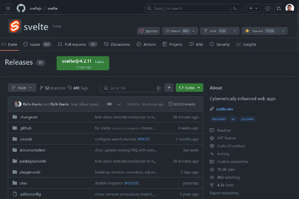
If there is an exe, it's under the releases link. On desktop it's on the right sidebar below "About". On mobile it's at the bottom after the readme blurb.
It's not obvious because the code is the main focus and GitHub would much rather people host their releases somewhere else.
And even if releases are hosted on github, there should ideally be a download links page somewhere that presents the different binaries or installation files in an easier to understand format, especially if the software is designed for non-developers.
That's where it is? I've been sneaking my way in by clicking tags and then the releases toggle!
I swear they move the link to release page every few months.
They purposely hide it, because they don't wanna tend to normies
I fixed it for them

What about up by the name of the repo? Your suggestion still looks almost reasonable, I like it!
Yeah actually that could work as well. Would be a really easy greasemonkey script
And then just push it to the main branch of GitHub, I'm sure they'll accept it ;)
Worst part is that this used to be a separate tab in the repo navigation. I still cannot conceive of a reason why they would move it from there to some random heading in the middle of the screen, except maybe so they can sell more GitHub trainings.
I think you're on to something haha
I've been using github for what, 10 years now? And I had no idea there even was a releases page.
A lot of projects don't use it or forget to update it for multiple versions so you probably aren't missing much.
If you use it as a developer you don't care about the releases page. You want to see the code and for latest version you just need the git tags. But I've also used it for stuff I just needed to run on my machine as an end-user. And for those you turn to the Releases page. That's where pre-built binaries go.
But it also depends on the target audience. Some projects, even if meant more as software to run than code to import, still target mainly developers or tech users in general and will not have more than just instructions on how to build them. Others, say a Minecraft launcher, or some console emulator, will target a wider audience and provide a good Releases page with binaries for multiple platforms.
This is really bad on mobile too. I usually flip to desktop mode to get to releases page quickly.
TRUE. the first time I used GitHub, the releases tab being all the way at the bottom in the mobile view confused me for a good while
I agree. Whenever I link someone I try to make sure to link directly to the release page.
Honestly, releases and the readme could be the first page on their own, you can push the code to another tab as long as the clone button is there. There's at most a 5% chance I'm just gonna raw dog the code straight from the browser anyways.
After downloading code from GitHub for years I can still take over a minute finding the file I want to download at times. Now that’s not long, but it’s why I’m there 90% of the time.
If there isnt a link in the readme.md I could be lost for days.
On mobile, they hide the code by default. Though the releases are still hidden underneath the readme.