Reclaim the internet: Mozilla’s rebrand for the next era of tech

Reclaim the internet: Mozilla’s rebrand for the next era of tech | The Mozilla Blog
Reclaim the internet: Mozilla’s rebrand for the next era of tech
Reclaim the internet: Mozilla’s rebrand for the next era of tech | The Mozilla Blog
I hate these rebranding wanks companies love to do.
I always assume rebrands are attempts to cover up something.
Unless they coincide with an entire board of directors change, it's bullshit.
Right. It's just a money wasting wank.
I love reading how companies justify their expensive rebrands.
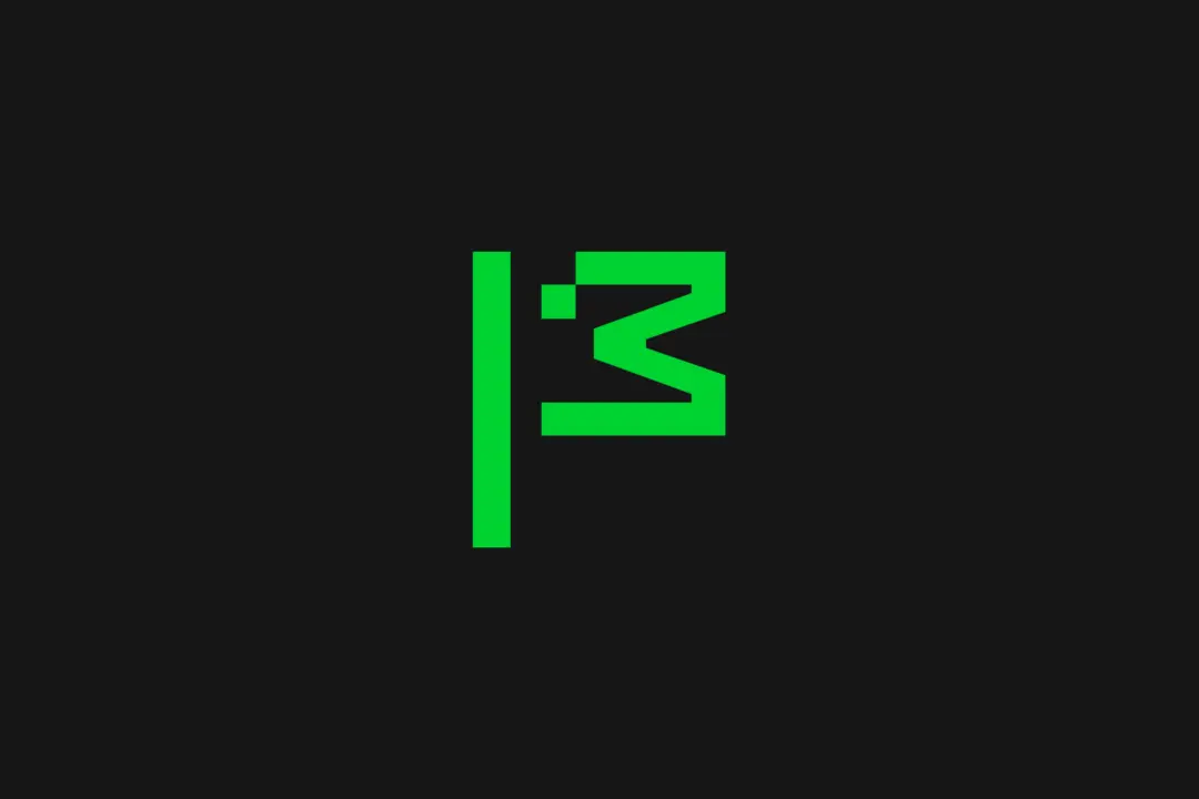
The flag symbol highlights our activist spirit, signifying a commitment to ‘Reclaim the Internet.’ A symbol of belief, peace, unity, pride, celebration and team spirit—built from the ‘M’ for Mozilla and a pixel that is conveniently displaced to reveal a wink to its iconic Tyrannosaurus rex symbol designed by Shepard Fairey. The flag can transform into a more literal interpretation as its new mascot in ASCII art style, and serve as a rallying cry for our cause.
Fuck off. This was designed by the intern the night before submission. It’s a fucking ascii dinosaur. The green doesn’t represent nature, it’s giving old monochrome monitor vibes, which doesn’t really scream “futuristic”. I’ve submitted enough bullshit design projects to know one when I see one.
You're saying half-baked monochrome pixel art doesn't come across as futuristic to you? Crazy!
To me it just reminds me of assets from the Dino game in Chrome. Good going, Mozilla.
To be fair, Mozilla had a dino first.
This was designed by the intern the night before submission.
YFW you realise this was designed by a well payed marketing and digital design team that make more money in three months than you make in a year, publishes straight to production, regularly bypasses the VPN for work, and still doesn't know how how to use the Oxford comma!
Also, I love how these things always need a lengthy explanation of what all this design vomit is supposed to mean and what it symbolizes, because there's no way you could tell by, you know, actually looking at it...
Wtf... mozilla had like the coolest logo among current companies and they just decide to replace with... whatever this is 😶
They're waving the white flag 🤦
Which coolest logo? The Dino head or the moz://a?
That second one was clever
For me it was mostly the moz://a
I agree. It was fire.
Mozilla isn't just another tech company
-> proceeds to act like any other tech company
Aw shit, Mozilla is dying and Google is losing Chrome. Google is going to buy Firefox and do what it did to Chrome.
That's ugly as fuck. I'm a Mozilla fan all the way, but what the fuck guys??
I don't get why they've started behaving do corporate recently
It's what happens to all companies when professional managers finally take over the entire control of the company. They have no values, no personality, no genuine vision or spirit to speak of.
A person who knows and is passionate about a topic can benefit from learning management when they get to leadership positions. But a professional manager who has never done a single productive or creative activity in their lives is an empty husk of a human being who will add no benefit to an organization. Buzzword rapping is not a valuable skill.
can't say I'm convinced of anything by a logo change...
Great use of donations.
Don’t remember this one on their questionnaire!
"Mozilla isn’t your typical tech brand"
Lisa is not like other girls.
This sucks. Mozilla used to be cool, but now it sucks.
They changed their logo into... a stick figure chicken head.
That's certainly something they did.
Green on black though. Like a terminal. For hackers! Bet you feel dumb now.
Drat, foiled agian! Damn you Stick Figure Hacker Chicken! Ill get you yet!
Even though we’ve been at the forefront of privacy and open source, people weren’t getting the full picture of what we do. We were missing opportunities to connect with both new and existing users.
...so we decided to do a massive rebrand because that will give people the full picture?
“Mozilla isn’t your typical tech brand; it’s a trailblazing, activist organization in both its mission and its approach,” said Lisa Smith, global executive creative director at JKR. “The new brand presence captures this uniqueness, reflecting Mozilla’s refreshed strategy to ‘reclaim the internet.’ The modern, digital-first identity system is all about building real brand equity that drives innovation, acquisition and stands out in a crowded market.
Yuck. All this does is send me the message that Mozilla cares way too much about being a trendy brand and has essentially capitulated in the face of the so-called market.
I really hope this ends up working out for them, I hope that I'll regret being so cynical about this announcement...
We teamed up with global branding powerhouse Jones Knowles Ritchie (JKR) to revamp our brand and revitalize our intentions across our entire ecosystem. At the heart of this transformation is making sure people know Mozilla for its broader impact, as well as Firefox.
Sure sounds like they're trying hard to make sure everybody knows how great they are. I still want to believe they won't abandon the mission, but I'm losing hope.
I fucking hate the Mozilla Corporation so much. This just highlights once more how fucking out of touch they are. Stop killing Firefox through your misguided antics!
Well, I guess I’m in the minority around here but I kinda like it. The animated dinosaur is a nice touch and the logo looks really good on the employee badges.
At first I took a few glances, agreed it was bad, and contributed my own snark to the comment chain without reading hardly anything, as is tradition.
Couple comments like yours made me actually read the article and look closer, and I'm sold, at least provisionally. If "take back the Internet" is sincere, we need a lot more of that energy, would love for it to catch on.
If it's "line go up" style nonsense a la blowing money on appearances while neglecting substance, then I guess it'll feel as cheap as it first looked lol
Excuse me sir, this is the internet, please go back to your regular scheduled shitposting.
Same! I dig the dinoflag. Tempted to grab a sticker for my laptop.
It doesn't really look bad, but it just seems like a waste of resources, which seems to be all they do nowadays.
Hey, remember when the old Mozilla 'throbber' icon had a godzilla breathing fire on the planet or something?
Hey, remember when Mozilla made mozilla the app?
Hey, remember the time before SeaMonkey needed to be supported by volunteers because paid staff couldn't do it for #reasons unrelated to being bored and sad at actual software maintenance?
Good times. GO BACK TO THAT.
Is that a duck?
The flag of Nepal.
I was thinking chicken.
How about you go back to making a decent libre browser, Mozilla. And keep the BS roar down for a bit, thanks.
Please tell me that's not their new logo (talking about the thumbnail)... Atrocious.
Edit: I don't want to sound like a dick, but this is what graphic designers do? I used to fuck around in Photoshop when I was 22 and make shit that looks better than this:
"Wow did you see the slide where they alternated a photo of a person on a green box, with a black box? And then on the next line, they did the black box first, THEN the photo in a green box. So creative"
"I like when they just put large random numbers on slides"
You would be surprised, C-suite people eat this shit up where I work.
I can't say I'm surprised... Just confirms that a diploma is just a piece of paper. I know for a fact that I could do this.
And that isn't in the same sense of seeing a Jackson Pollock painting and thinking "that's just splattering paint around, I could do that." Like no, I could 100% do this.
Is this a bad sign or omen ?
I guess you could read it as an indication of commitment to their change of direction. And their new direction sucks.
So yeah, I don't read it as a good sign.
I would love to love Mozilla. I still like Firefox. But it seems everything they are doing is the opposite of what I would have wanted them to.
Big corpor who overpays their higher ups while ruining their most important product for years does a rebrand to show how quirky and amazing they are instead of fixing the problems at their company? Nah. I'm sure "this is fine"!
Bad choices.
I don't hate the new logo, but I would have preferred they kept the italic l's
those were slashes
Yeah. You can even visit moz://a in Firefox.
Same
I want someone explain what does the flag next to mozilla mean.
It's in the article ...
The flag symbol highlights our activist spirit, signifying a commitment to ‘Reclaim the Internet.’ A symbol of belief, peace, unity, pride, celebration and team spirit—built from the ‘M’ for Mozilla and a pixel that is conveniently displaced to reveal a wink to its iconic Tyrannosaurus rex symbol designed by Shepard Fairey. The flag can transform into a more literal interpretation as its new mascot in ASCII art style, and serve as a rallying cry for our cause.
The only part of this that I like after a quick skim is the font, and that's only because it's serif. (Although the not changing size thing is also cool)
Didn't they just get a new logo last year or so?
Well, it may be stale by now.
i actually really like this rebrand, i think the logo is a little step back, but this looks like it'll allow them to have more of an identity
At least their website's redesign puts more focus on firefox.
Was only a matter of time they ruined that logo after what they did to the Firefox logo
I like the new logos for both Firefox and Thunderbird. They keep. Their identitily while being more modern and streamlined. I liked the old ones too, the new ones just feel like a natural development.
I liked the ones that actually looked different instead of clinically streamlining it