You're viewing a single thread.
My 5 and S look the same
44 0 ReplyMy 5s are apparently unreadable for most people. Whenever someone asks me what that sign or letter is on anything I wrote I will say it's a 5 without looking. They'll say how I didn't even look. But it's always correct.
16 0 ReplyYour 5 is just a fucked up b, right?
7 0 ReplyNo, it's a 5. Idk why people don't see it.
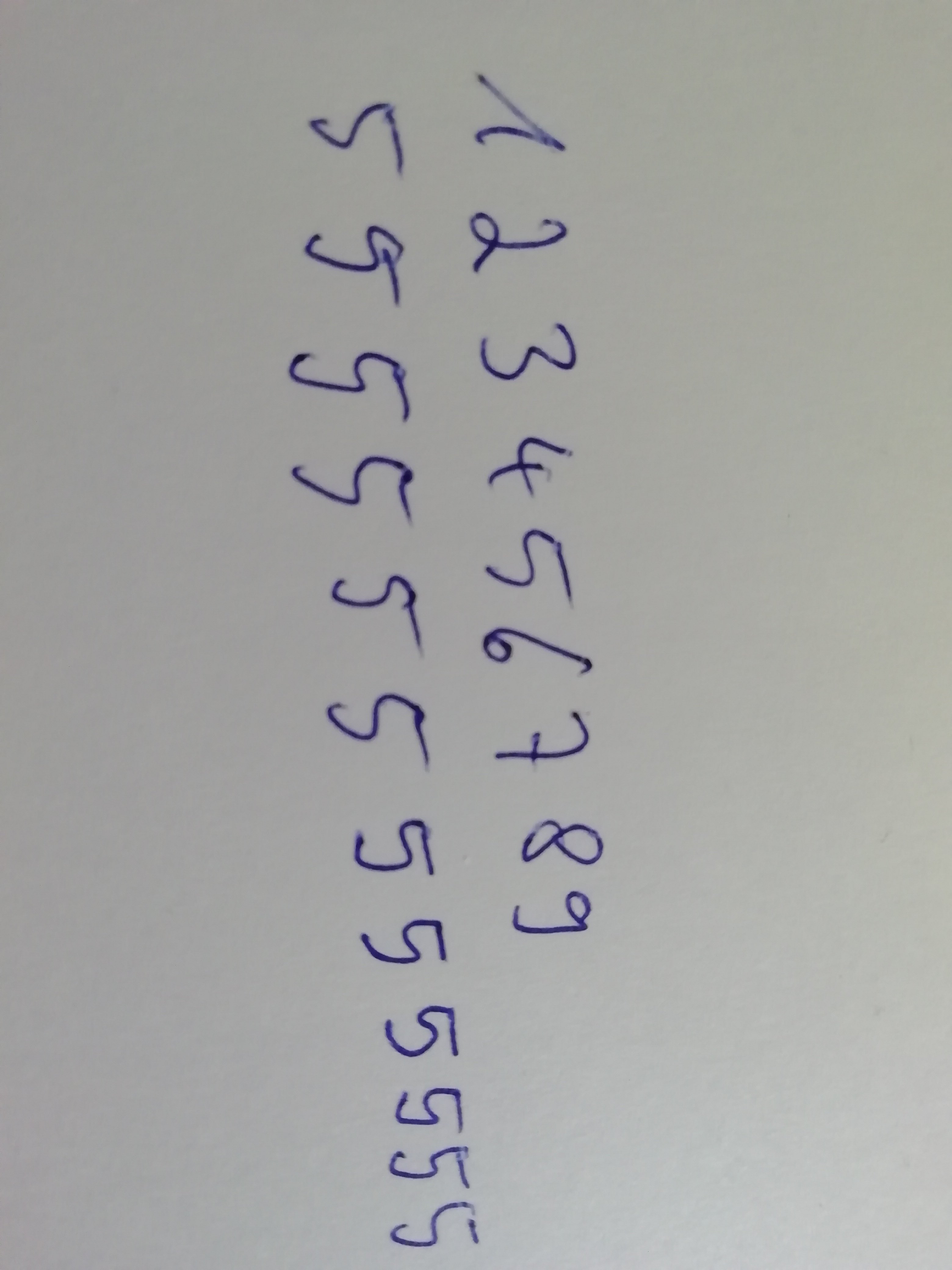
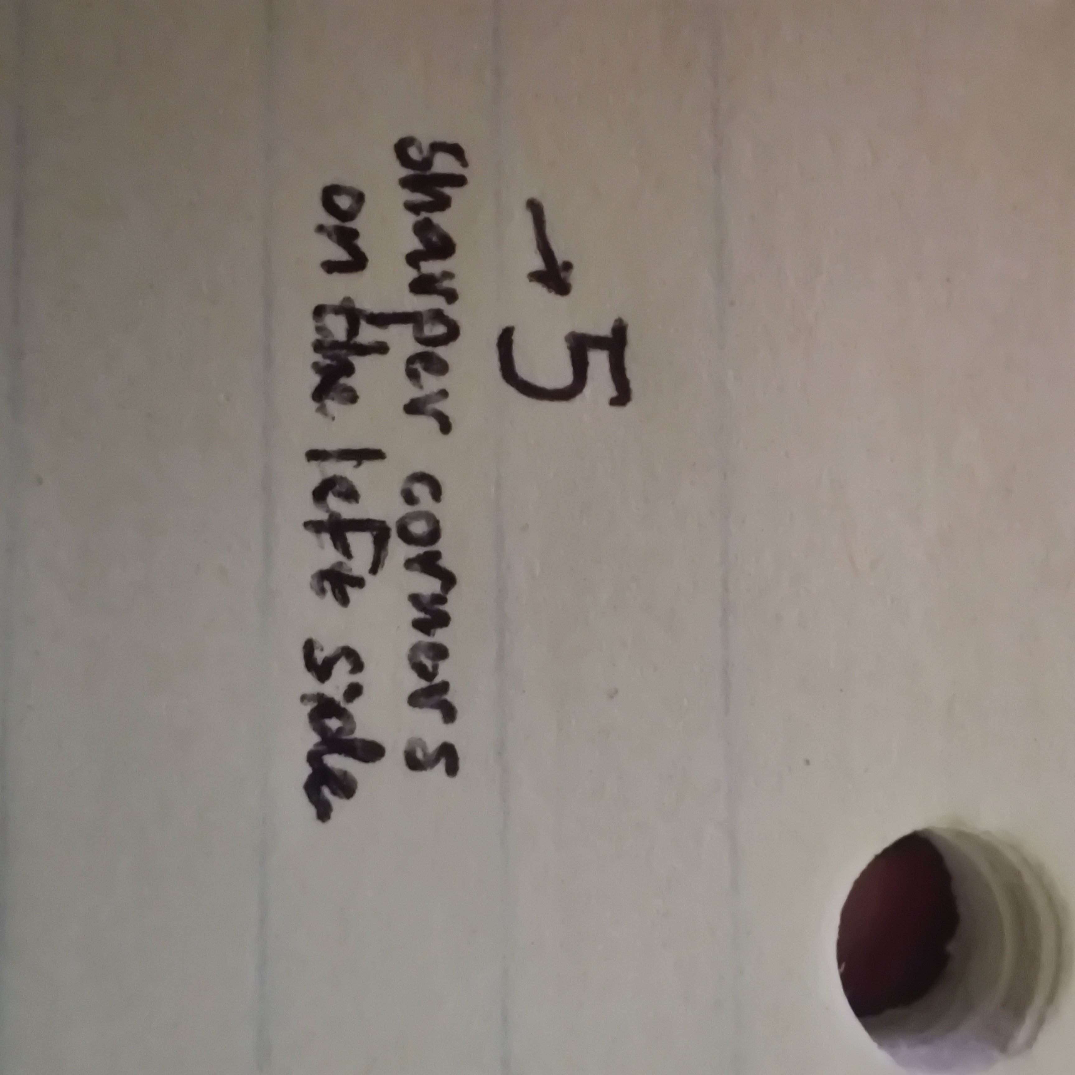
7 0 Replyattach pic of your 5 and let lemmy judge
12 0 Reply
8 0 Replyyeah kinda messy I rate 5/10
here's my suggestion for making it less ambiguous

8 0 ReplyThat's still a 5 out of 10 though.
4 0 Replyanyways why does lemmy rotate our images without our consent?
4 0 ReplyOutrageous isn't it.
2 0 Reply
Good lord finally someone with legible writing
3 0 Reply
I think that's perfectly readable. My 5 just looks like an upside down L.
3 0 Reply
I’d like to see too. My 5’s look like S’s so usually people can’t discern it when I write the number in writing.
6 0 ReplyPosted my fives as a reply to another comment if you want to check them out. Apparently they are 5 out of 10.
1 0 ReplyYeah they’re a 5/10. They’re better than mine though, but I can somewhat see how someone may not know what your 5 is (emphasis on somewhat).
2 0 Reply
Same
8 0 Reply5ame?
12 0 Reply
I draw the "top" of my 5's with a separate line to help avoid this. Also I cross my 7's and Z's. If it's just a jumble of alphanumeric characters, I'll cross the 0's and add the serif to 1's.
4 0 ReplyMissed opportunity for "5ame"
3 0 ReplyI went to Bangor, A55!
3 0 ReplyMy 5 wears the top line like a floating hat. It's frustrating even to myself
3 0 ReplySame, I can't write a 5 in one smooth motion, when I try to it ends up looking like an S.
3 0 Reply
